Six Wealthtech Apps with Outstanding UX
- WealthTech
Wealthtech apps help us manage our wealth better—and our experience as users only gets better when they’re easy to use (and pretty to look at!). The success of Wealthtech apps (partly) depends on their UX. Part of creating a lasting UX is ensuring its simplicity and that the app is user-friendly. When a Wealthtech app has exceptional design elements and easy navigation, it engages customers and encourages them to promote it. This can lead to a higher ROI as well. Superior UX also means a consistent app design.
In this blog, we will be highlighting our top picks for Wealthtech apps with the most outstanding UX.
WealthFront
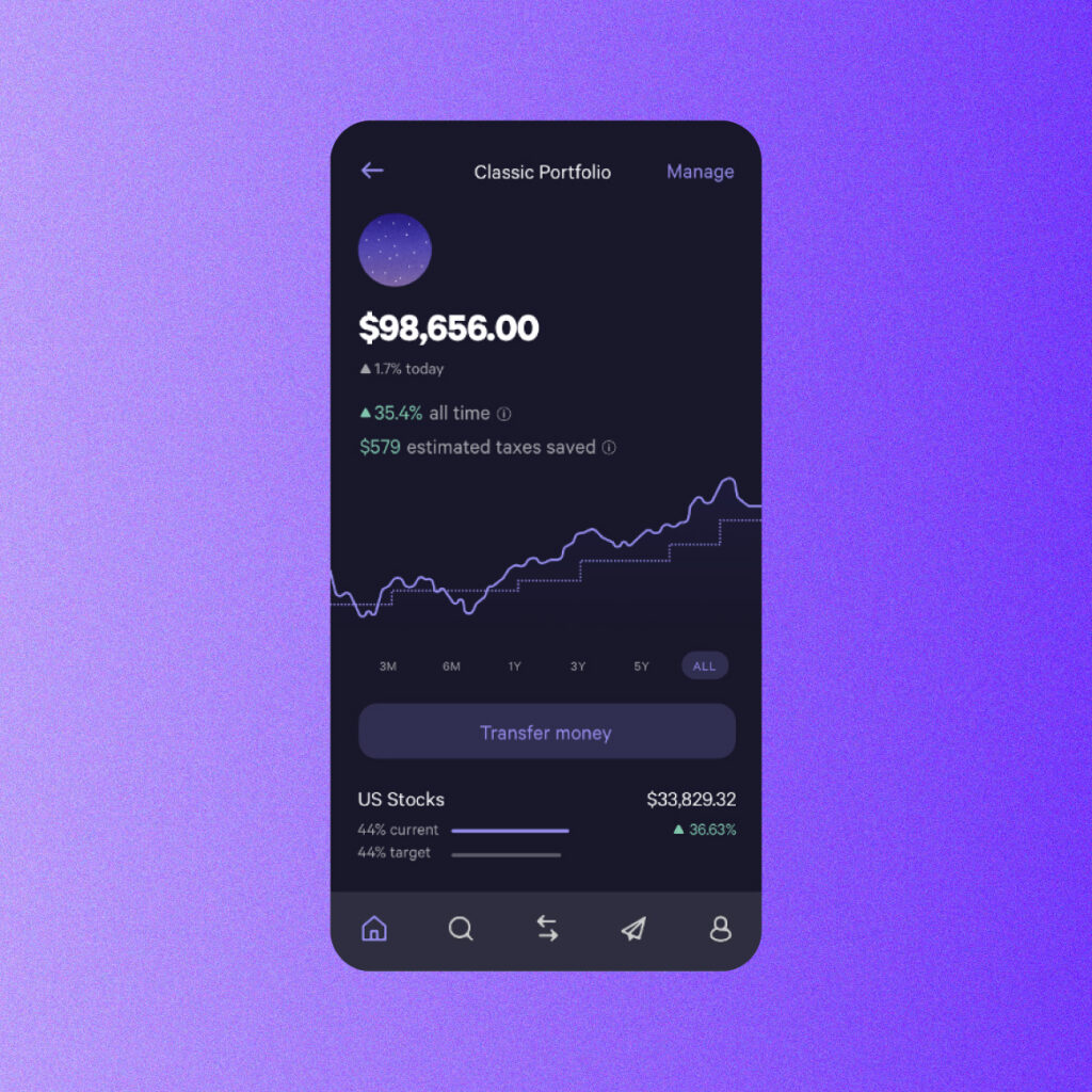
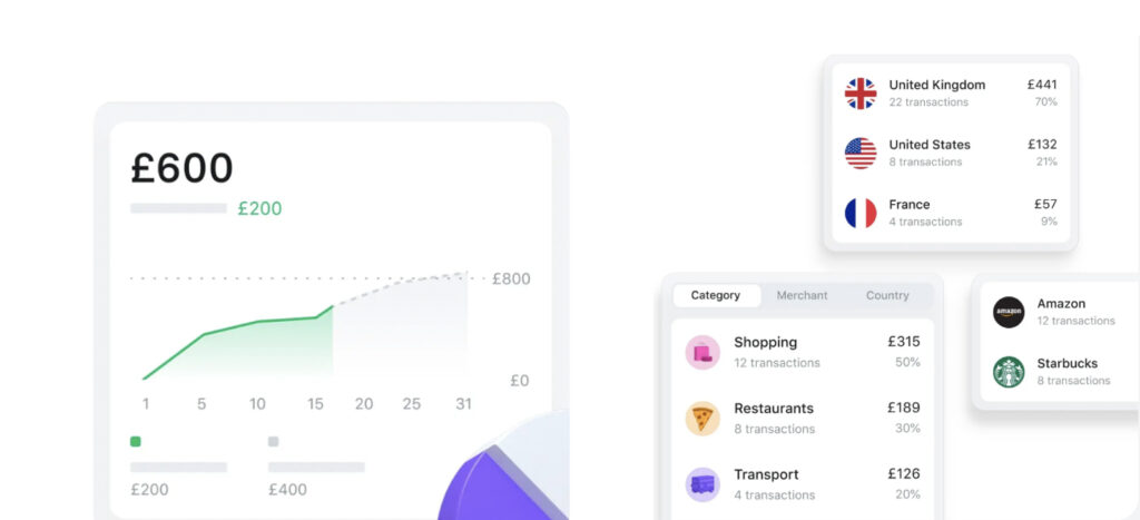
WealthFront aims to democratize customer access to high-quality financial advice. The WealthFront app has a simple UX that allows users to make their first portfolio and access advice on how to get the most out of their returns. The portfolio has a simple interface and lets users know, for example, their estimated targets saved. It appears like this:
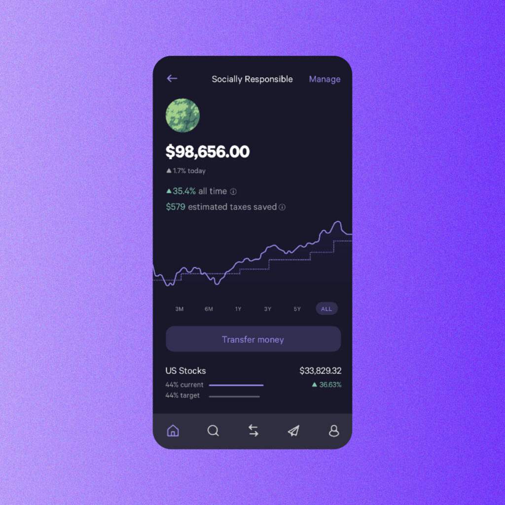
Users have a choice to begin with a portfolio built for interests such as Social Responsibility, then customize it according to their preferences. The app offers 100s of funds in different categories. Some of these include, but are not limited to, clean energy, technology, and crypto. It also warns users if it detects their choices are not lining up with their preferred risk level.
The company’s “Socially Responsible” portfolio offers customers a faster UX as they can enjoy a diversified portfolio in a matter of seconds. Users can also get in touch with financial experts who have evaluated dozens of funds to merge social responsibility with future performance. The UX also contains elements of personalization that allows customers to add extra funds to support the causes most dear to them.
The Social Responsible profile looks like this:
WealthFront’s retirement planning scheme on the other hand, allows users to track their progress by showing them their investments, with the software automatically managing their trades and investments in a time efficient manner.
Vitaliy Bobrykov, a designer here at Windmill, states:
“I like WealthFront as it has a unique and cozy style. Its main focus is on investing for long-term purposes (like retirement). I like how they designed onboarding and guidance, how they are educating users, and how they make complicated things about investing look simple for users.”
Revolut
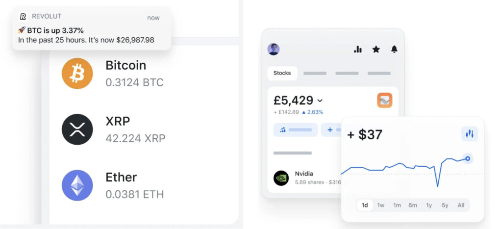
Revolut helps customers efficiently track their daily spending and long-term planning for savings and investments.
The app offers users a convenient UX as it helps them calculate limits based on their spending predictions. Users get notifications when they’re reaching their spending limit. They can even get a full picture of their spending as the app offers them a breakdown by merchants, categories, countries, etc.
Revolut also offers users a diverse UX by allowing them to invest in Bitcoin, Ethereum and other tokens in more than 30 currencies. With a simple tap, they can trade from as little as $1.
Vitaliy Bobrykov states:
“Revolut is a big product with a bunch of features, but the app is clean and clear with simple structure and navigation, and it doesn’t look overwhelming.”
Robinhood
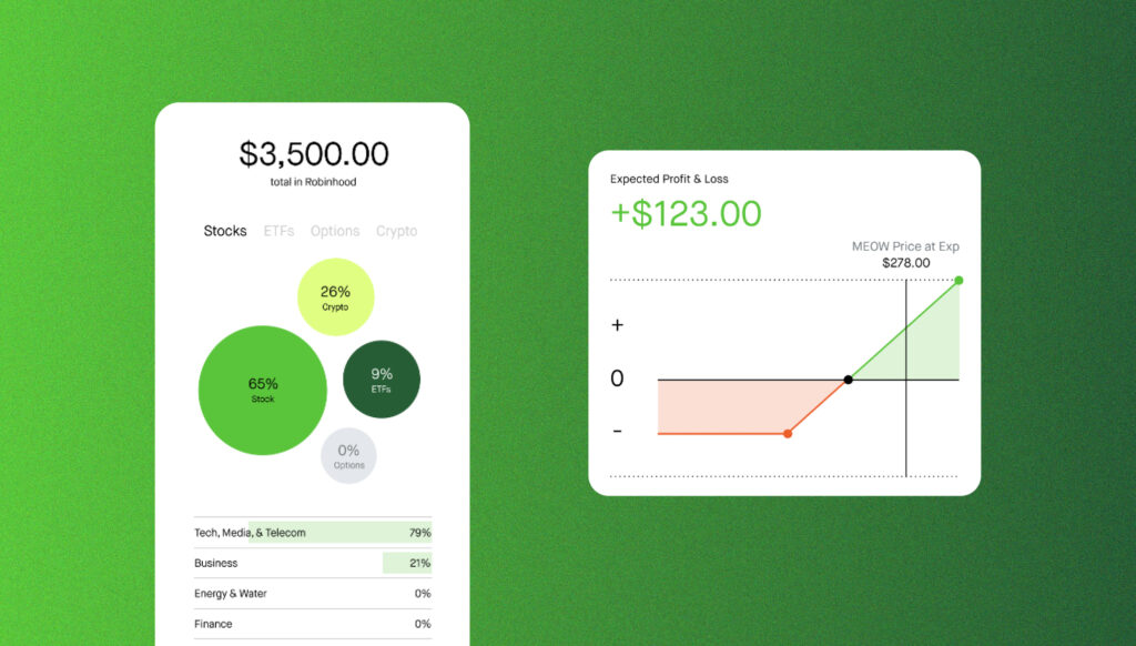
The company’s main mission is to “democratize finance for all”. They make products that allow users to start investing at their own convenience. They can start by adding $1 towards companies that they value.
Stash
The company was created to provide “everyday Americans” with the opportunity to create wealth and invest. Their personal portfolio is not only diverse but is created according to the user’s risk level. The UX is clean and simple and the design comprises the perfect mix of black, white, and blue.
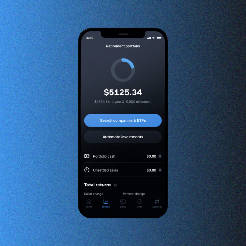
Users can also create a “Smart Portfolio.” With the use of robo-advisors, users can have a seamless UX as they’ll help them make investments in line with their goals.
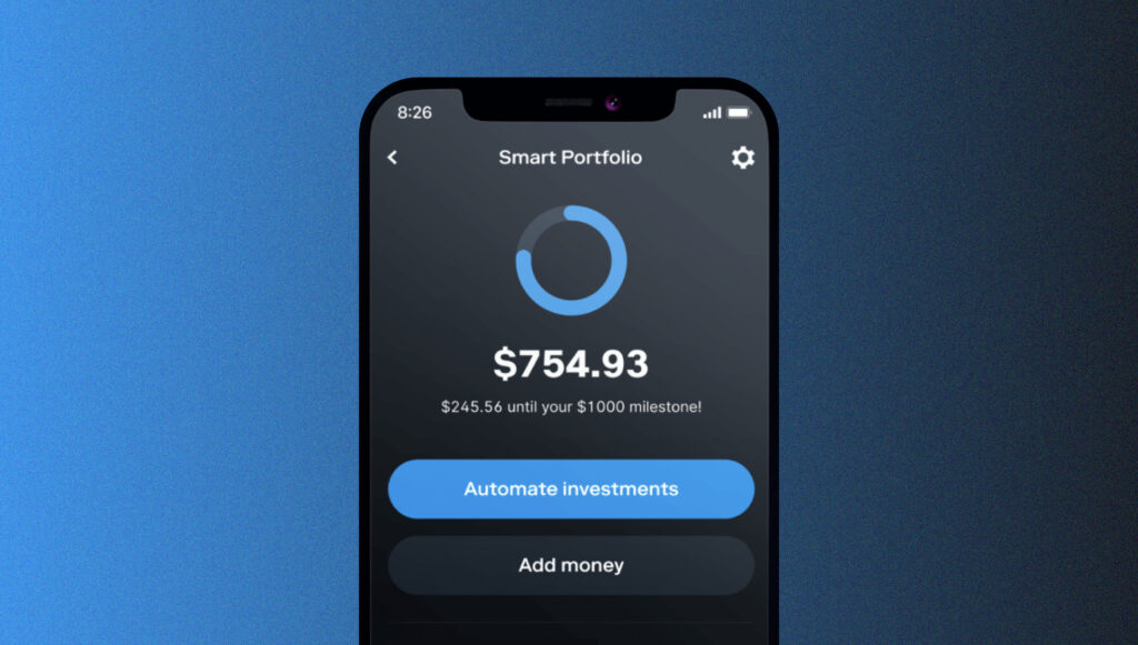
The retirement portfolio also offers a convenient UX, allowing users to even search for companies and ETFs easily.
Betterment
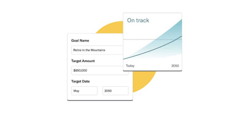
The company aims to help people expand their everyday investments. The app offers an immersive UX consisting of eye-catching colors and images. Users can easily add the amount they wish to invest and why, and any other investing goals. The general investing account appears to be like this:
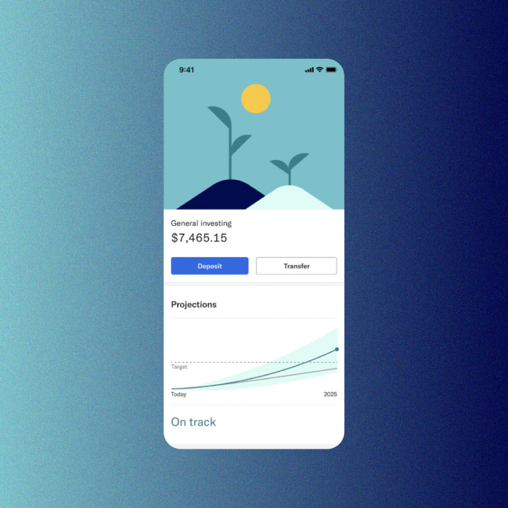
Users can easily track their goal’s performance in their account. The UX is made easier with the use of graphs.
The retirement planning section of the app allows users to calculate how much they want to save against their spending needs, link to external accounts to gain a clearer perspective of their financials, etc. The UX is simple and allows users to track their progress by easily inserting their target amount and date.
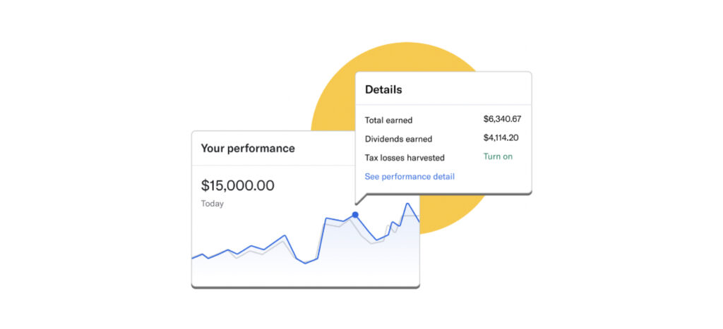
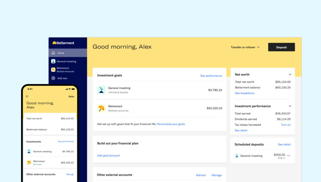
Betterment’s all-in-one dashboard is the epitome of great UX. Not only does it allow users to view their total net worth, but they can also add shared accounts that let them keep track of shared finances. These are just a few of its many features!
Topaz
Topaz is a wealth management platform that delivers a slick experience for its HNWI (high-net-worth individual) users and their advisors alike.
It’s clear that the app is designed with user experience front and center. Its UI is simple and familiar, but also sophisticated and personal. In fact, personalization is embedded in every aspect: it learns what news each of its users finds interesting, what investments they might want to make, and even allows goal-tracking that pulls together a wide range of asset types.
Conclusion
Wealthtech apps are useful to anyone who wants to manage and save their money. Thanks to modern technology, innovations such as robo-advisors have only made this faster and simpler. Great UX is one of the main ingredients of Wealthtech apps. Without it, they would not attract a wide user base or stand tall against their competitors. Whether it’s offering simple navigation systems, easy-to-read fonts, or attractive colors, exceptional UX encompasses it all.
Windmill Digital offers exceptional digital product design and strategy services. Our team is highly experienced and will make you stand out against your competitors. For more, please contact us.