Psychology of Color in Financial App Design
- WealthTech
They say don’t judge a book by its cover, but what if you judge it by its color instead? Pretty colors are a sight for sore eyes, and this is true in the world of financial app design too. Colors are innately linked to our psychology as humans. Color psychology is related to the study of colors as a factor in determining human behaviour. This notion was explored mainly by Swiss psychologist Carl Jung who regarded color as the “mother tongue of the subconscious.”
Color has a significant emotional and cognitive effect on users and is one of the essential components of fintech app design. Customer user experience can broadly be understood if the concepts of color psychology are applied. Research has found that customers make subconscious decisions about products in 90 seconds; 62-90 percent of that is because of color.
Color: How it’s linked to emotions
Research has shown color to impact our mood, sleep, and overall wellbeing. Every color symbolizes different things, and it can be beneficial for designers to know the connotation attached to each when designing fintech apps.
Purple, for instance, represents royalty and luxury, whereas black can represent sophistication, formality, or security. Given that many color combinations can be made for fintech apps, it can be challenging to determine the most appropriate one. Your color palette can evaluate the quality of UX.
Warm colors stimulate feelings of contentment, positivity, and energy. The colors red, orange, and yellow can also signify hazards. Cool colors on the other hand, including green, blue, and purple, are typically gentle and relaxing but can also symbolize sorrow. If a company wants their products to symbolize well-being, beauty or safety, green, blue, or purple would be suitable options.
Color and culture
Colors symbolize different things in many cultures, and it’s a good idea for designers to familiarise themselves with these other implications when designing products. This is especially true for companies that operate in different countries and being sensitive to how color fits into a certain culture can help you meet users’ needs better.
In Western culture, the color black symbolizes death and grief, whereas, in Far Eastern cultures, it can represent good health and success. In the Middle East, black can symbolize mystery and mourning, whereas, in Indian cultures, it can represent evil or negativity. UX designers need to empathize with these cultural implications when creating color palettes for fintech apps.
Generally speaking, blue is the safest color choice globally. In Europe and North America for instance, it represents power and trust. This is mainly why American banks choose blue as the primary shade of their company logos. However, in places like the Middle East or South America, it can signify sorrow and melancholy (getting “the blues”).
Color coding for Fintech products
In the world of fintech, green and red hold immense importance. They represent buy and sell, profit and loss, etc. When choosing colors for fintech apps, think about visibility and clarity. White backgrounds with bold colors, for instance, can help stimulate users—contrast is key. Reflect on which colors showcase your clients’ values and brand image or how they can help them stand out in the market.
In finance, it’s key for a brand to represent trust, safety, and esteem. While you may want your product to demonstrate status and wealth, it’s important to focus on factors like loyalty alongside.
Blue is one of the most popular choices for fintech brands as a primary color. Not only does it represent trust and loyalty, but it works well with the main colors of fintech (green and red) as well.
A study by Hurlbert and Ling found that participants from both genders react quicker to blue color contrasts. Other colors UX designers can include in their color palette include purple, which represents wealth and harmony, or black, linked to sophistication and style. Black is also an extremely versatile shade and is popularly used with white.
We spoke to Windmill Senior Designer, Vitaliy Bobrykov, to talk us through his approach to color in one his financial app designs.
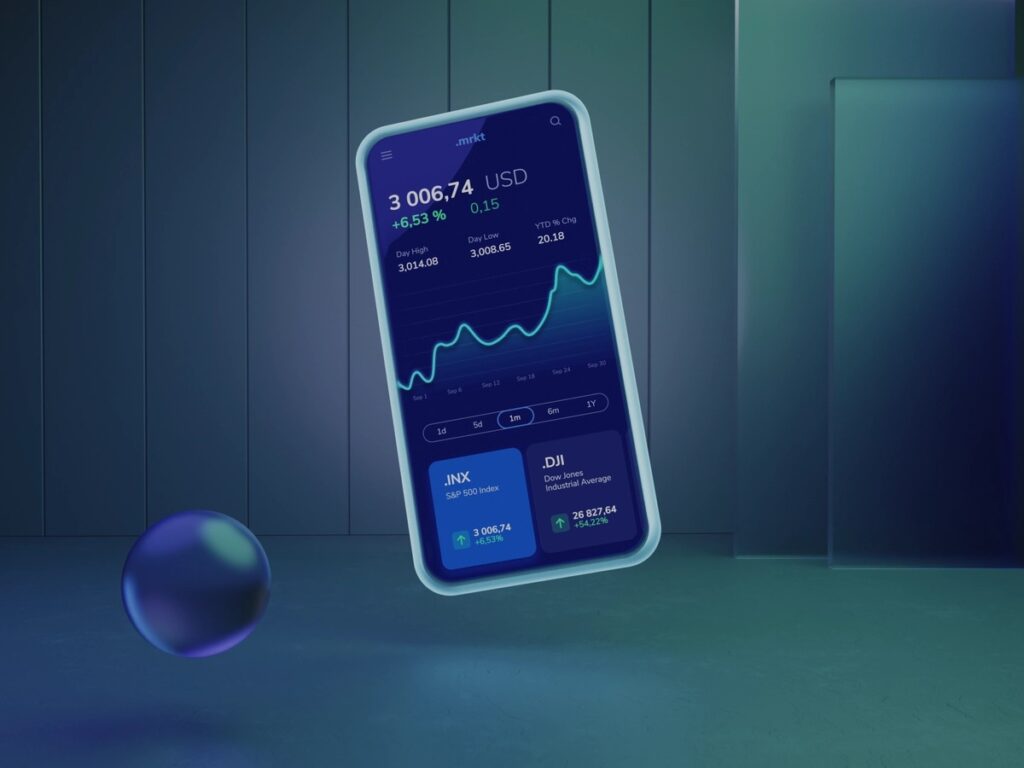
“When we work on a big client project, color choice should be dictated by brand strategy (which demands specific research) and design system, but in a conceptual project like this, it goes more from my personal aesthetic preferences and experience. The color blue can be considered “traditional” for financial apps based on the psychology of color perception (Revolut, Public.com, Coinbase, etc). And as for me, the blue color is easy to work with, [it’s easy] to find nice-looking pallets and complementary colors. Besides that, I wanted to experiment with a dark theme, that is not only popular but a “must have” for today’s apps.”
Conclusion
Color psychology is an interesting field that can be applied to financial app design and knowing its basics can help you meet customer needs better. Colors exist in our everyday lives, but they have a subconscious control on us that can affect our decision-making when buying products. Understanding and empathizing with which colors appeal to your customers is a huge part of meeting their needs. Chances are, they won’t use your products if the first impressions of it, i.e., its colors, don’t appeal to them.
To harness the power of psychology in your financial apps, shoot us a message.